Helping people with serious mental illnesses manage their symptoms
Waverider
Waverider is the first provider-client platform that engages mental health clients with custom tracking plans rooted in Dialectical Behavioral Therapy (DBT). There are 196,180 DBT mental health providers in the US and 52.9M people living with mental illnesses.
Led product design of the MVP · from initial research to visual design
Healthcare
1 year and 7 months
2 Designers, 2 Researchers, 1 Product Owner, 3 Developers, 1 QA, CEO
Figma, Miro, Whimsical, Loom, Zoom, Jotform, Slack
30–60 min workflows reduced to under 5 min
The problem
Diary cards are barely completed.
Diary Cards are a key component of DBT and are meant to be filled out daily to find patterns and reflect. Most providers use paper ones · which are not customizable, get lost, and clients usually forget to complete them, affecting the treatment.
The challenge
Building a holistic solution to drive behavior change.
Creating a platform for providers to build custom digital Diary Cards, and an app for clients to help manage their daily symptoms and behaviors · allowing both to see progress, learn from patterns, and update the plan accordingly.
- Providers satisfaction: MVP average rating 8/10 (NPS) · Providers loved: customizability of trackers, reporting in table/chart view, convenience vs. paper
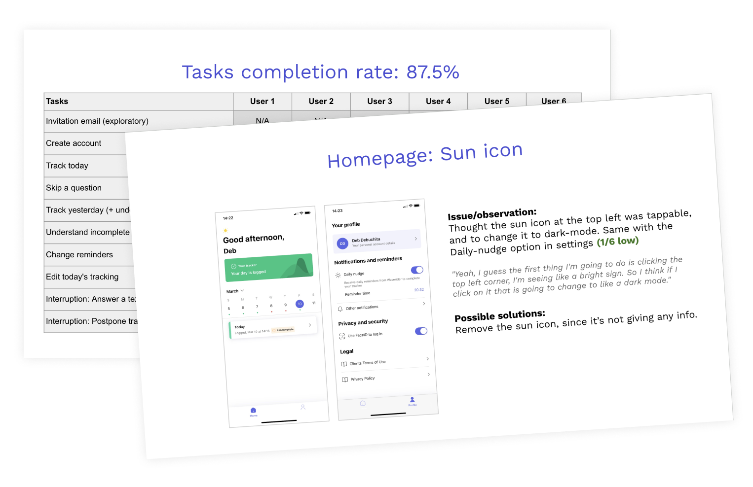
- iOS app task completion rate: 87.5% · App Store comment: "I can't express how grateful I am for this app. It's truly flipped a switch in my mental health management."
- Waverider got its first paying user
- Providers reported up to 2× more consistent daily symptom tracking among engaged clients
- Progress toward validating product-market fit
A Lean UX Journey
Waverider is a startup, so we used a Lean UX process for the MVP creation.
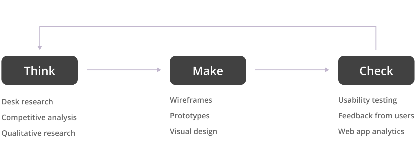
Desk research: What is the problem, and what is already done?
General problem research
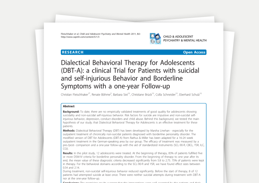
We focused specifically on bipolar disorder. I read clinical studies about DBT and bipolar disorder, along with information about the state of the industry. We had 2 clinical advisors that helped us understand the subject better.
Customization features benchmark
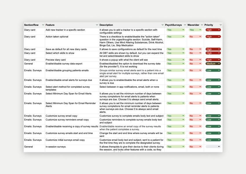
Once the basic platform was developed, we learned that customization was one of the key needs of providers, so I created a document comparing the customization features of one of the biggest competitors.
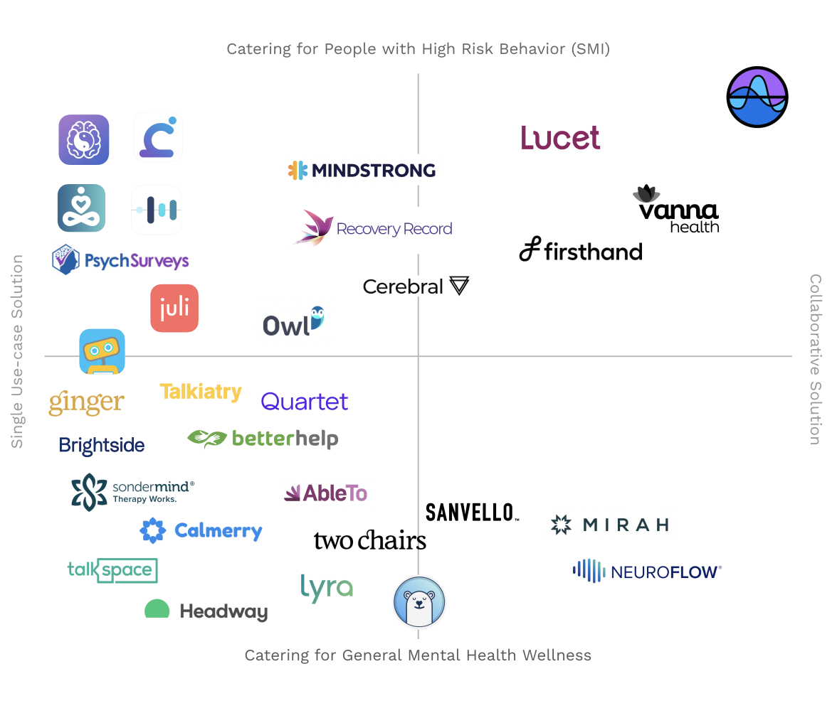
Competitive analysis
When I joined, there was a thorough analysis done on the strategy of where the product should fit in the industry. Over the course of two years, many new competitors arose and we updated the map several times during the process.
Qualitative research: What do users feel and think?
User interviews
We conducted many different types of interviews to understand the platform's users · both providers and clients · to understand their main goals and pain points.
- User interviews: Intense sessions where I learned about the disorders and what helps when managing symptoms.
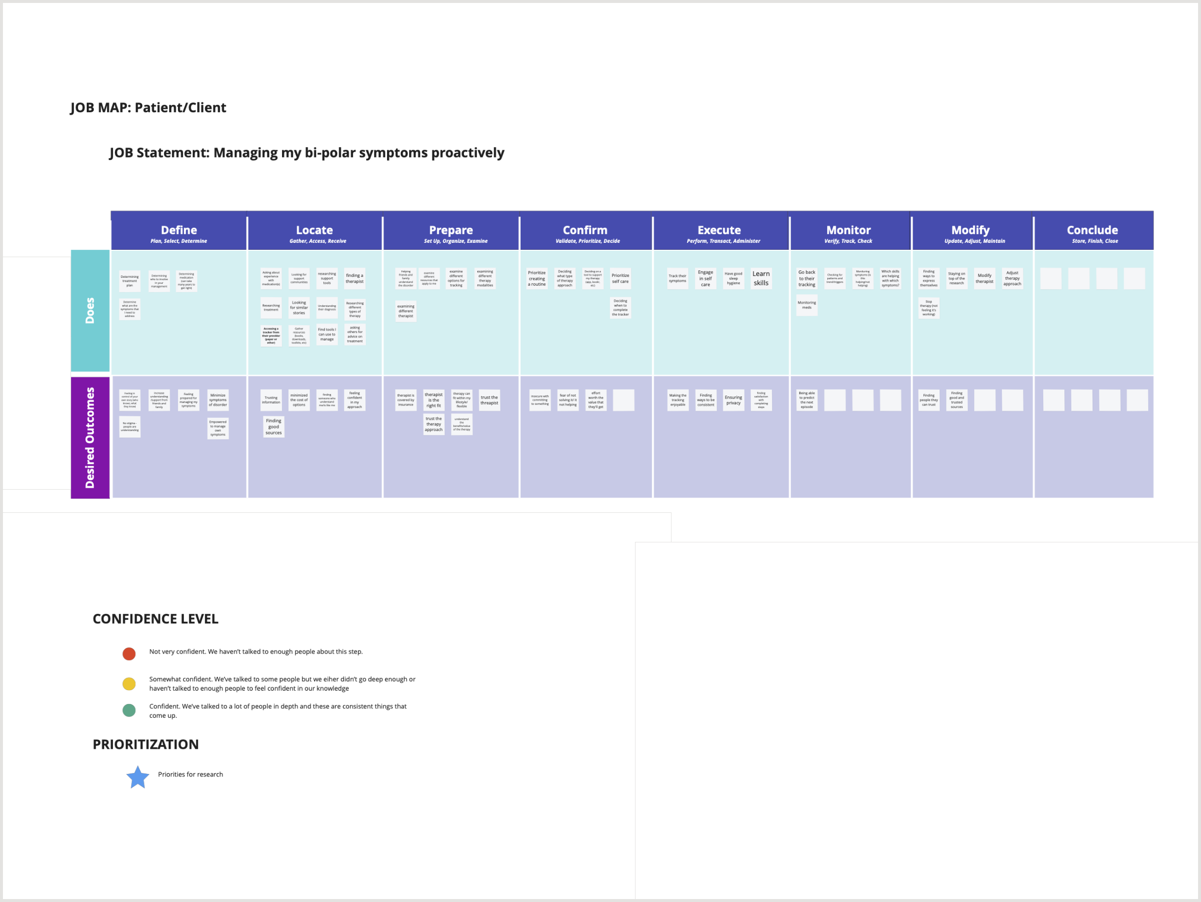
- JTBD interviews & mapping: Understanding deeper what job both actors wanted to accomplish, the obstacles, and how to improve.
- Concept testing: Used many interviews to concept-test ideas and get qualitative feedback, allowing us to iterate fast.
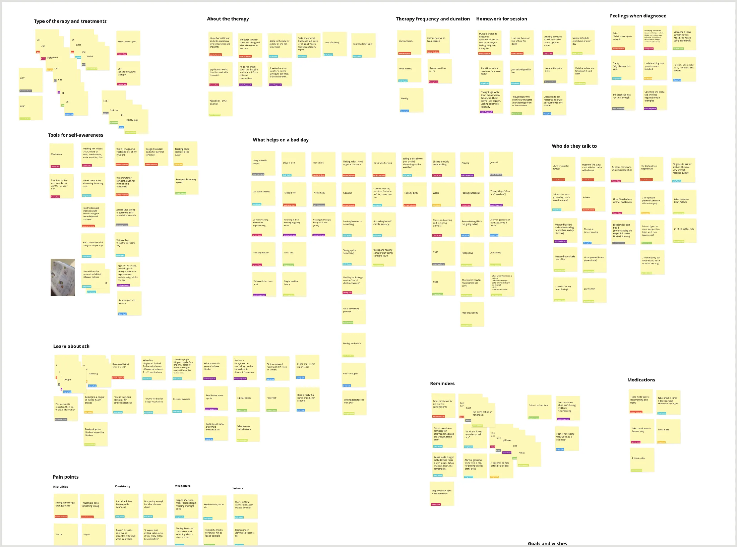
Affinity mapping to find patterns
Team workshop to map the job of the client
Social media listening
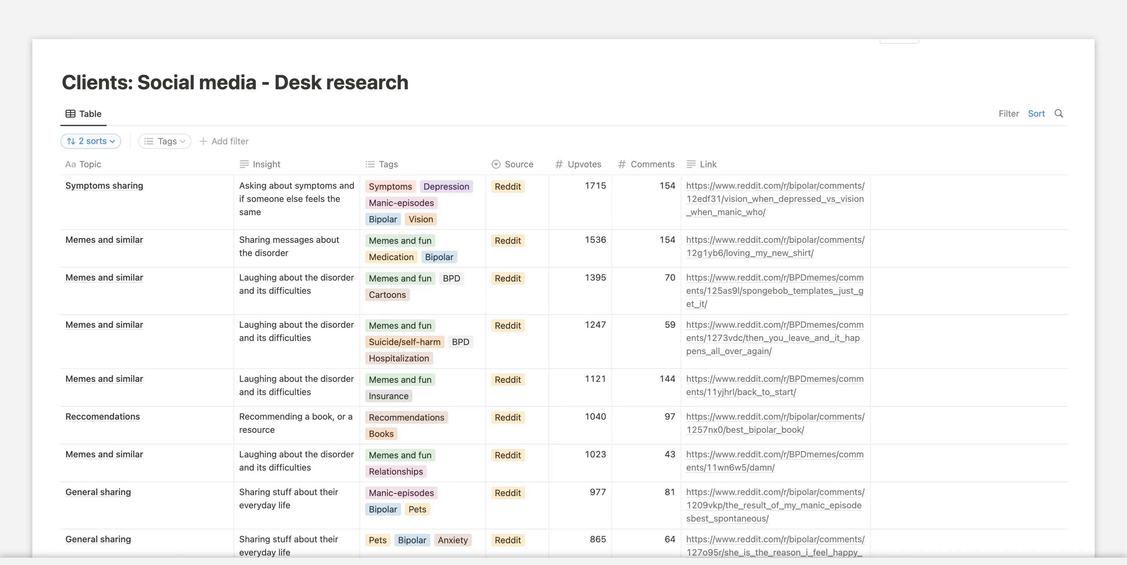
Once we had the main features, I researched posts in many Facebook groups and Reddit communities to find out what clients were looking for and understand if we could achieve that with new features.
Design and development: How do we build a platform that meets both users' needs?
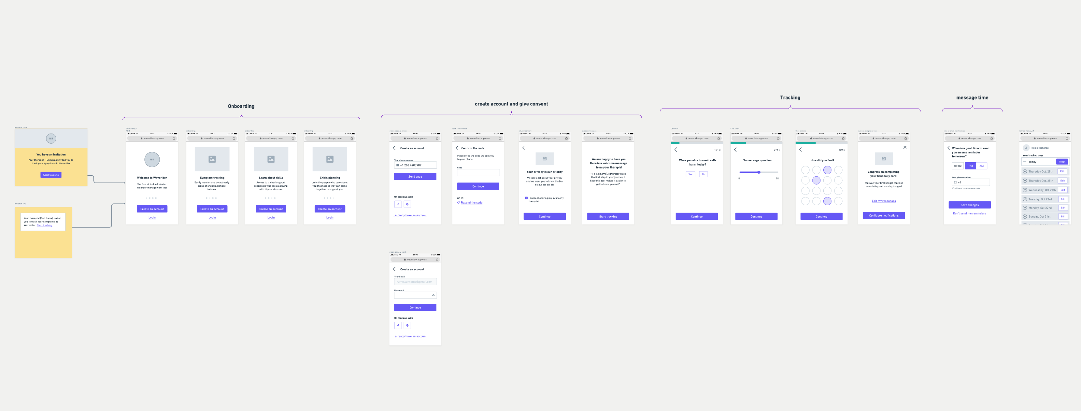
Wireframes and wireflows
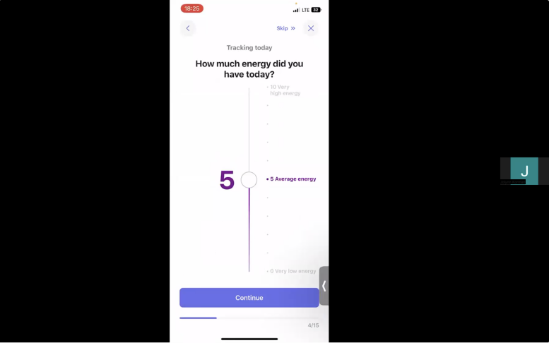
The first MVP was a web-only responsive platform for both providers and clients · the fastest way to test the concept. Then we created an iOS app for clients. There were many wireframe and concept iterations that allowed us to learn from users and test ideas.
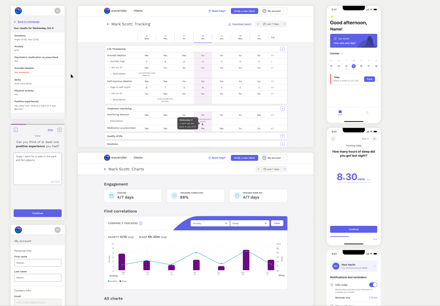
High fidelity screens
The web platform was designed and developed in a very short timeframe. For the providers' platform, the focus was on content clarity and making tasks as straightforward as possible. For the clients' app, the focus was on making it easy and fast to complete daily · since they had to do it consistently over a long period.
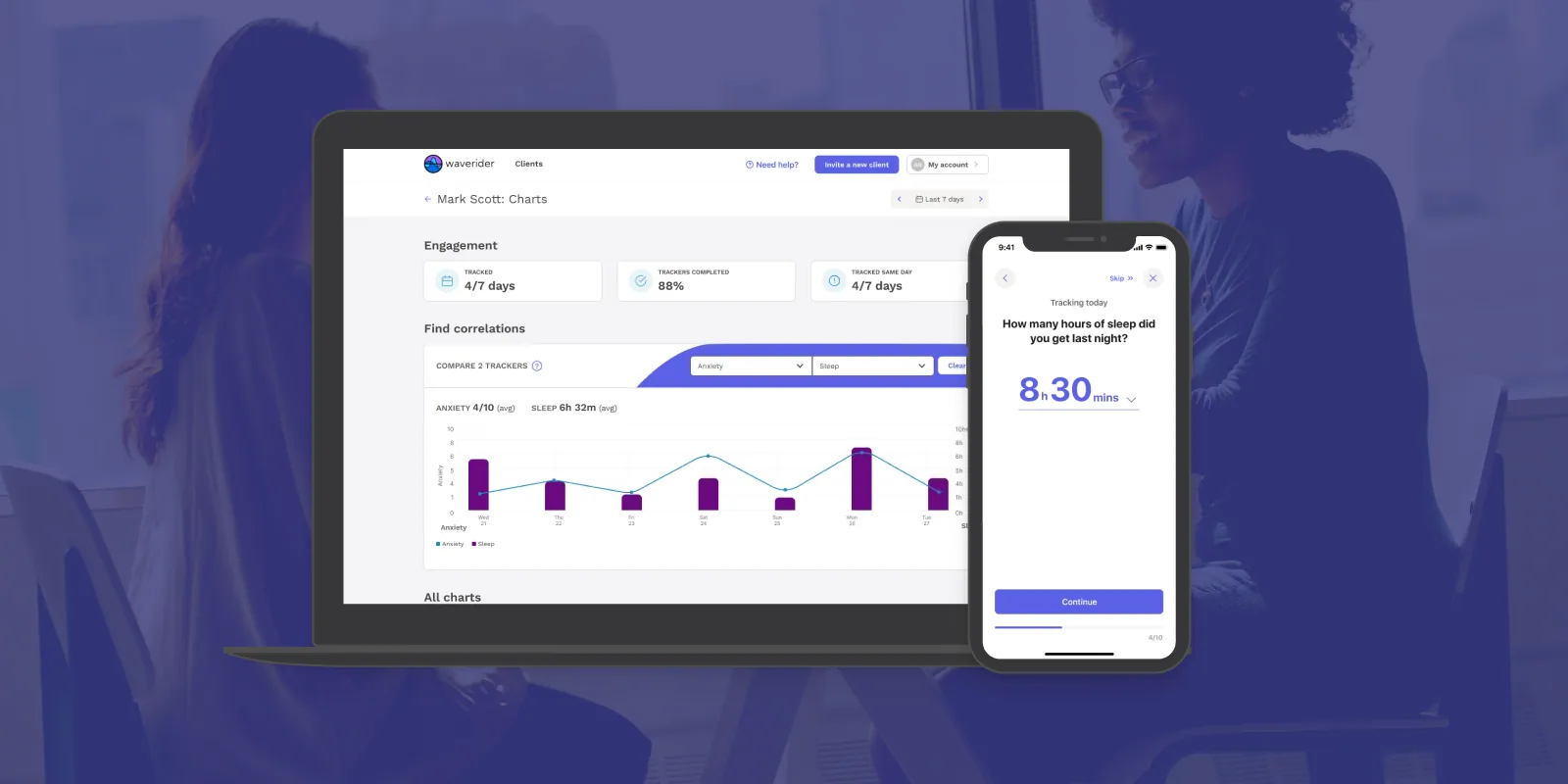
Designed complex data visualization and tracking experiences to help providers quickly identify behavioral patterns and patient progress.
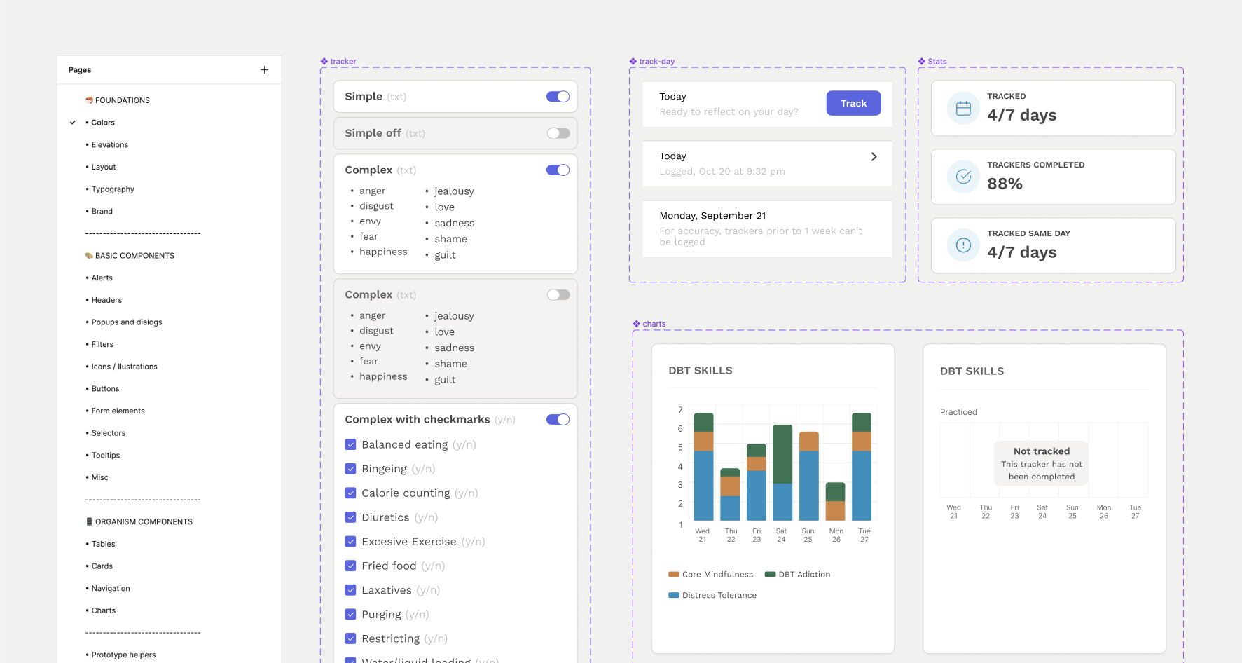
Design systems
We created specific Figma files for the design systems of the web platform and the iOS app. This allowed our team of two designers to collaborate better, ensured consistency across both platforms, and made it easier to collaborate with developers.
Validating the vision: What is working and what needs iteration?
Remote usability testing
I prepared and conducted remote usability tests for the web platform with providers and for the iOS app with clients. This allowed us to find usability issues and iterate. I synthesized each round in easy-to-digest slides presented to the team.
Surveys for feedback
Some important insights from surveys with the first users:
- Templates for customization: Most providers used the default tracker list; we started exploring templates as a starting point.
- Week summary: Clients went through their input before therapy sessions · we began thinking about ways to summarize the week.
Web app analytics
The platform had Mixpanel installed, and the website had Hotjar. We used the stats to iterate flows and understand users more deeply.
Learnings
Designing for mental health requires balancing clinical structure with emotional sensitivity. One of the biggest challenges was creating tools that felt useful and approachable for both providers and patients without overwhelming either side.
This project also reinforced the importance of iterative validation in healthcare products, where usability, trust, and long-term engagement are deeply connected.
Next case study
Sync · Glucose tracking for athletes