Helping athletes understand how their body processes glucose
Sync Biometrics
Sync is a bio-tracking company that helps people understand how their body reacts to their daily lifestyle habits and helps them adapt these habits for maximum health and longevity.
Sole interaction and visual designer
Healthcare
4 months
1 PM, 1 Product Designer, 2 Developers, CEO
Figma, Loom, Slack, Notion
Full app designed & shipped in 4 months
The problem
Health is not one-size-fits-all.
In one of the biggest health crises of our time, millions of people suffer from type 2 diabetes, obesity, and many other health conditions. The need to enhance metabolic health through personalized approaches is known as the quantified-self movement.
The challenge
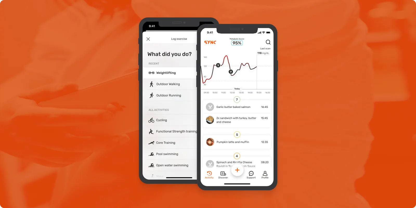
iOS IoT glucose monitor app.
Creating an IoT app for iOS that integrates with a continuous glucose monitor, enabling athletes (as early adopters) to monitor their dietary intake and physical activities · facilitating an in-depth understanding of their unique physiological responses to diverse factors.
- Designed and shipped a fully functional IoT app in 4 months, from competitive analysis to App Store launch
- Usability testing showed that users could interpret glucose trends and complete core tracking flows with minimal guidance
- Successful remote asynchronous collaboration with developers and PM
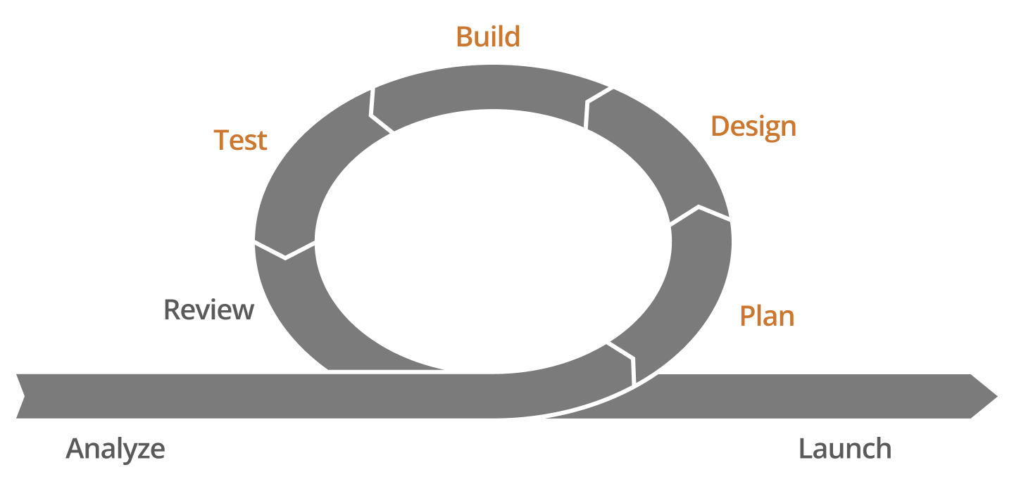
An agile journey: Crafting the future in 4 months
It was a very short project, and my role was mostly UX/UI design. An Agile methodology was used for the development of the app, along with a Kanban board.
Making a plan: What is currently out there?
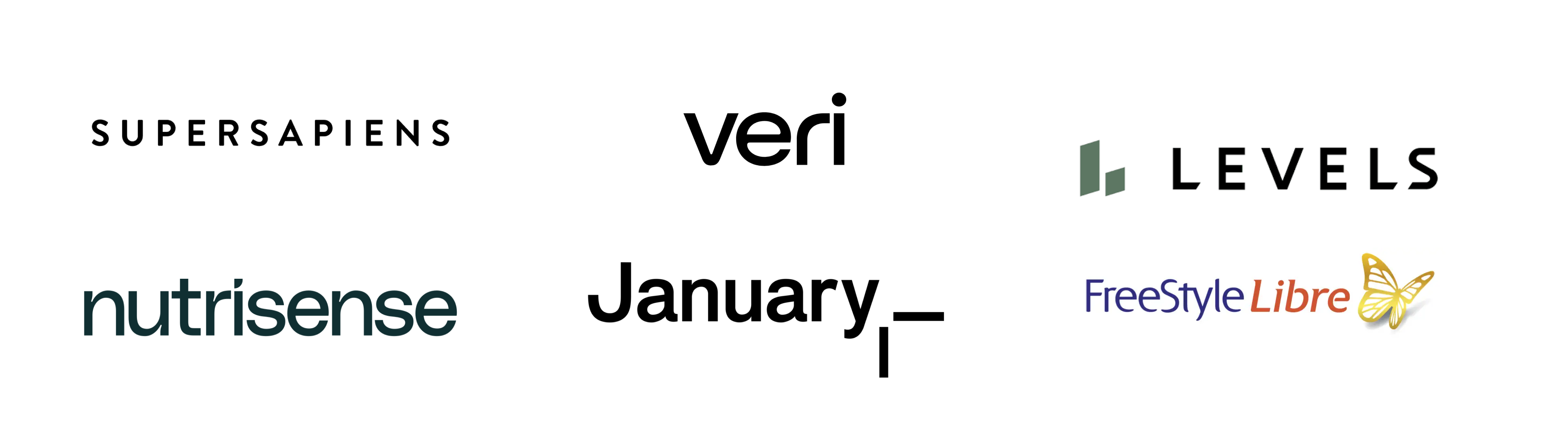
Competitive analysis
There were a few competitors already working in the same field. I explored the different features and interfaces of all of them.
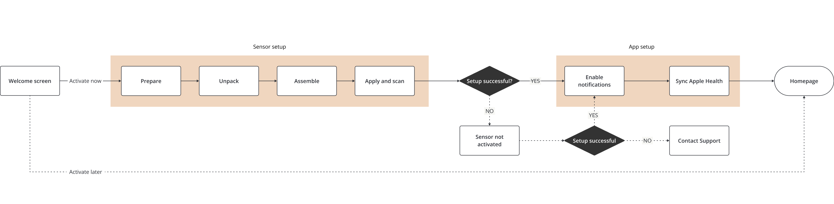
Understanding the hardware
The platform used a continuous glucose monitor, so I had to learn how it worked and what restrictions it had in order to plan for different scenarios. The version we used had to be scanned at least once every 8 hours to avoid data loss · after that, the sensor starts to replace the earliest data in its memory with new data.
A major challenge was translating complex biometric data into experiences that felt understandable and actionable for non-expert users.
Designing the vision: How will we make learning about their body an engaging journey?
User flows
Some flows were technically complicated and we needed them to feel easy · for example, the flow for setting up a new sensor.
Visual design
The app needed to look clean, futuristic, human, and a bit scientific. The colors of the app were drawn from the existing branding guidelines. There were many edge cases to explore and all the iterations were done directly in high-fidelity screens.
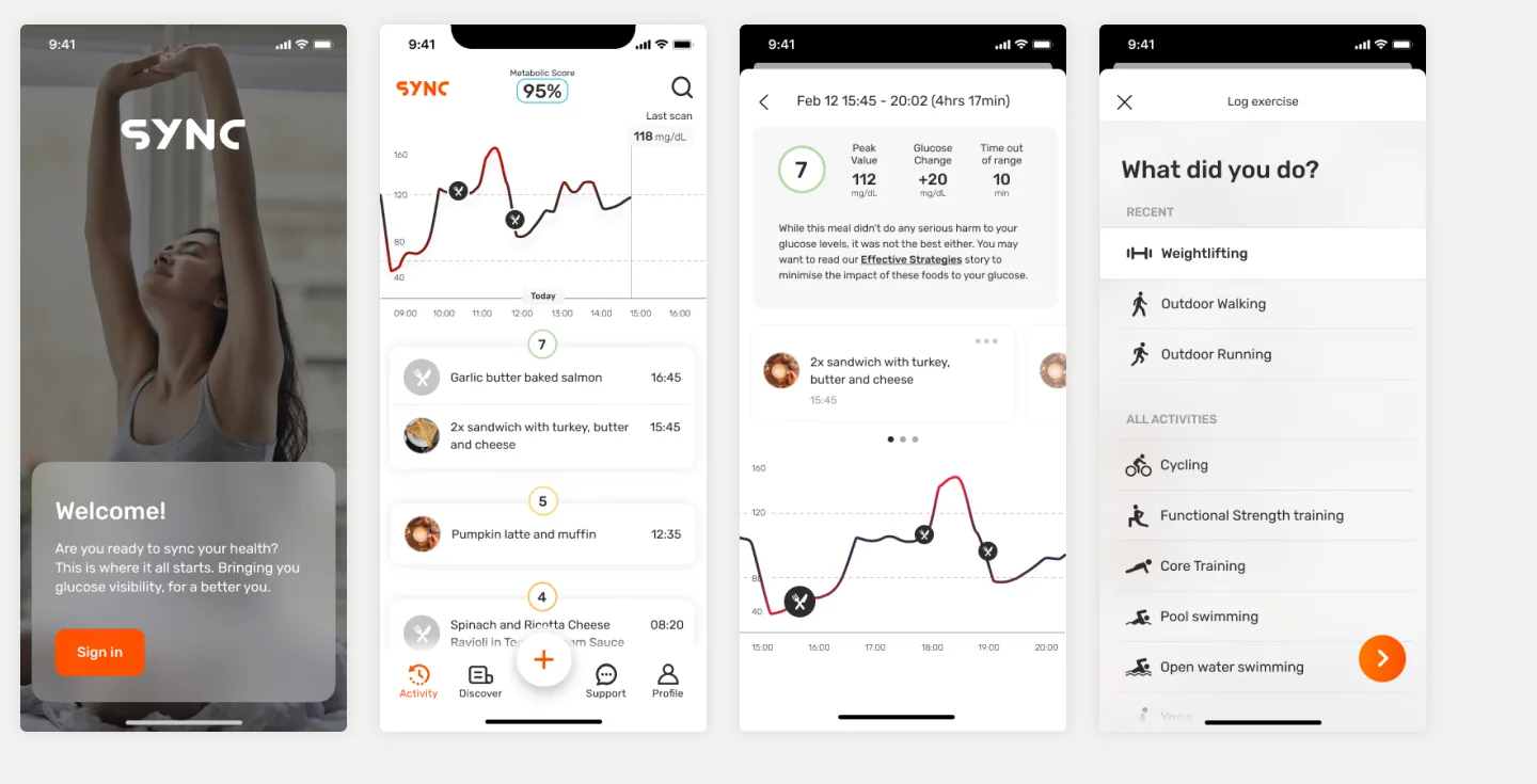
Icons design
This task involved creating numerous icons for different physical activities and meals. The challenge was making sure all the icons were in system and as clear as possible.
Micro-interactions
Competitors had a very modern look with animations and micro-interactions · it became imperative to incorporate these elements into the MVP.
Collaboration: How to succeed remotely and async?
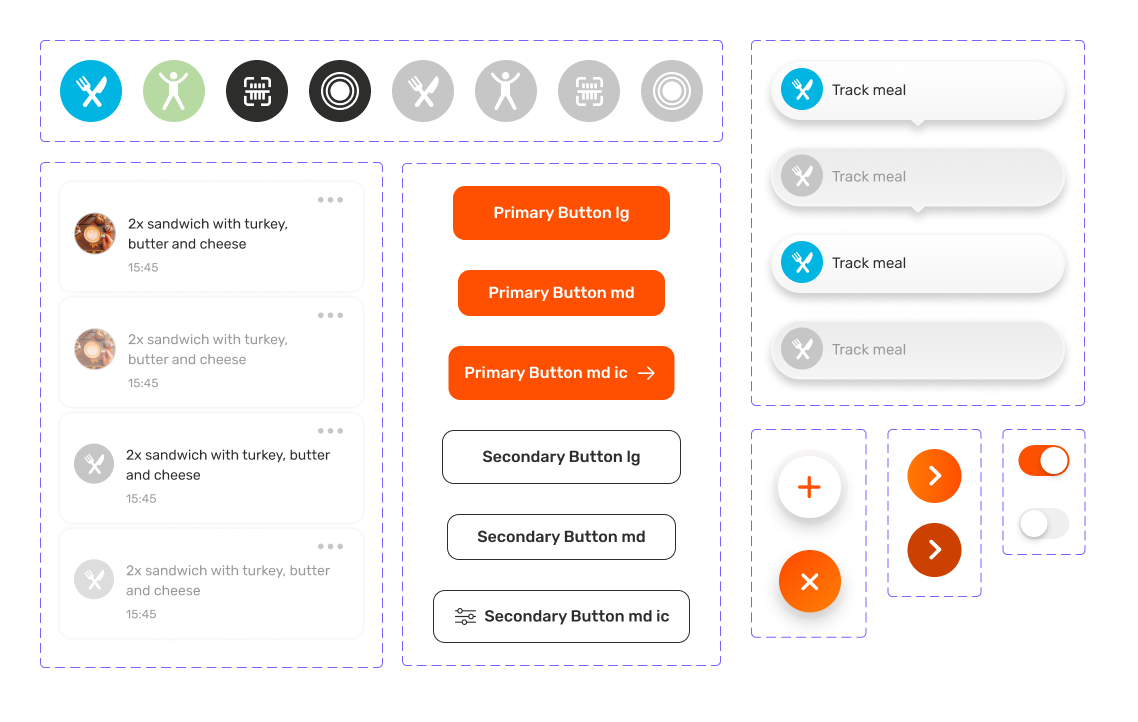
UI Kit and video clips
I collaborated remotely and asynchronously with a team of 2 developers, a project manager, and the CEO. To collaborate better with developers, I created a UI kit with all the different variables for the components, and also sent frequent short videos to ensure clear communication.
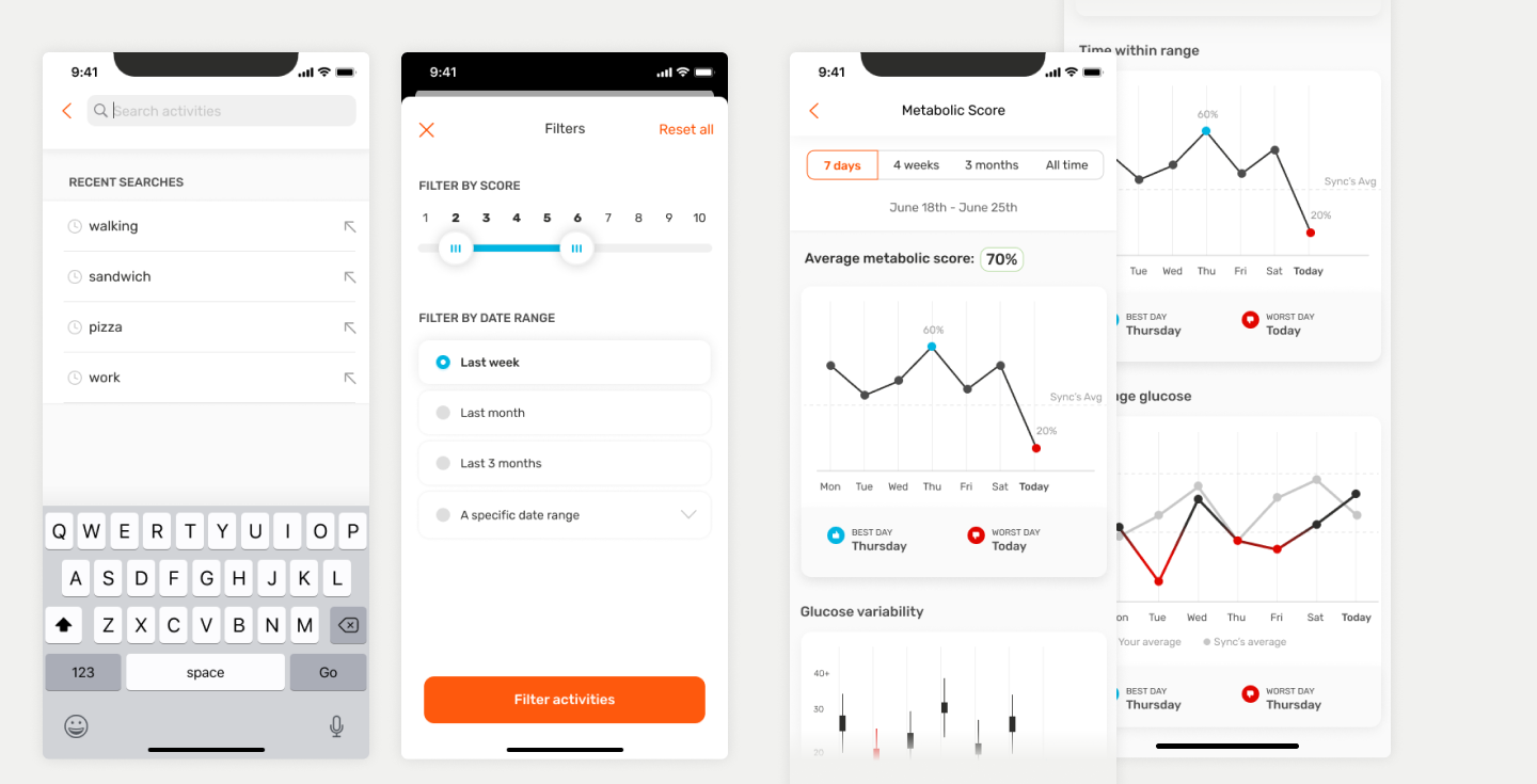
Testing the journeys: Is it intuitive?
Guerrilla usability testing
There was no time allocated for proper usability testing, but I worked on continuous testing with different potential users to ensure what I was designing was intuitive and iterated accordingly.
Over 80% of users completed the main tracking flow successfully during usability testing.
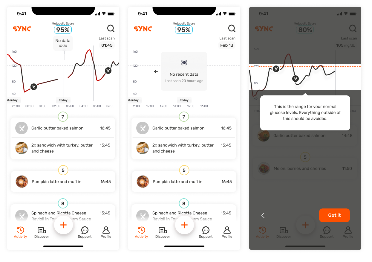
Based on insights from guerrilla tests, I added messages when there was no data and a walkthrough of the homepage for first-time users.
Learnings
This project reinforced how difficult it can be to make highly technical health data feel approachable and meaningful to everyday users. Designing for biometric tracking required balancing scientific accuracy with motivation.
It also highlighted the importance of rapid iteration and close collaboration in early-stage products, especially when building entirely new behaviors and mental models for users.
Based on the cost of the hardware, the timing for Sync turned out not to be right and the project was eventually abandoned.
Next case study
Paper · Caribbean insurance app