Helping Caribbean citizens protect themselves from natural disasters
Paper Insurance
Paper Insurance is a platform aimed at people living on the Caribbean islands (Antigua and Barbuda, Barbados, Bahamas, etc.) that allows them to get an insurance quote in minutes and manage their claims without going physically to an agency · while also allowing agencies to create automated reports to underwriters.
Led product design efforts, together with another designer
Insurance
1 year and 10 months
2 Product Designers, 2 Developers, CEO
Figma, Miro, Whimsical, Loom, Slack
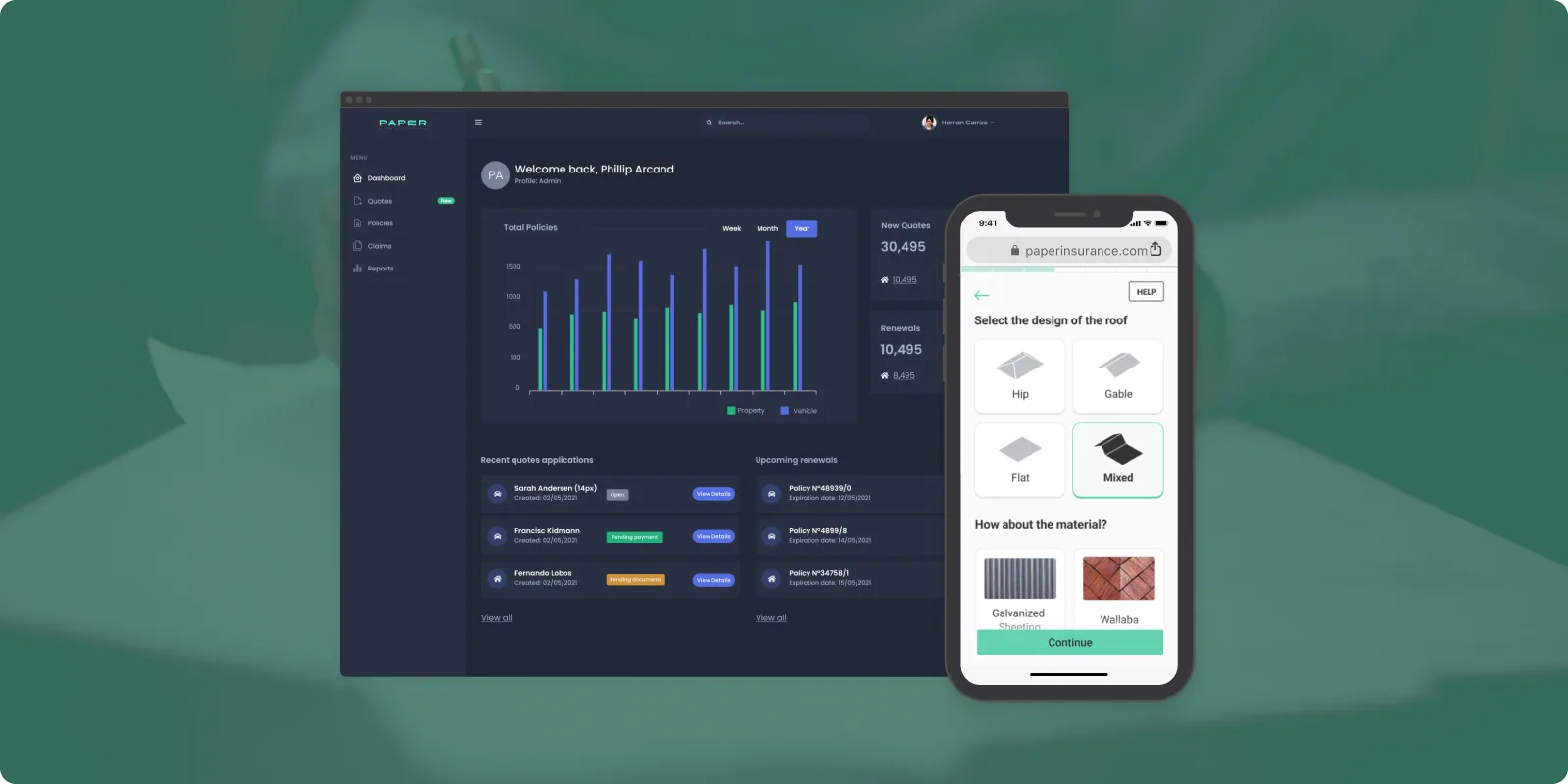
Quote time: 30–60 min → 5 min
The problem
Time-consuming processes for a crucial need.
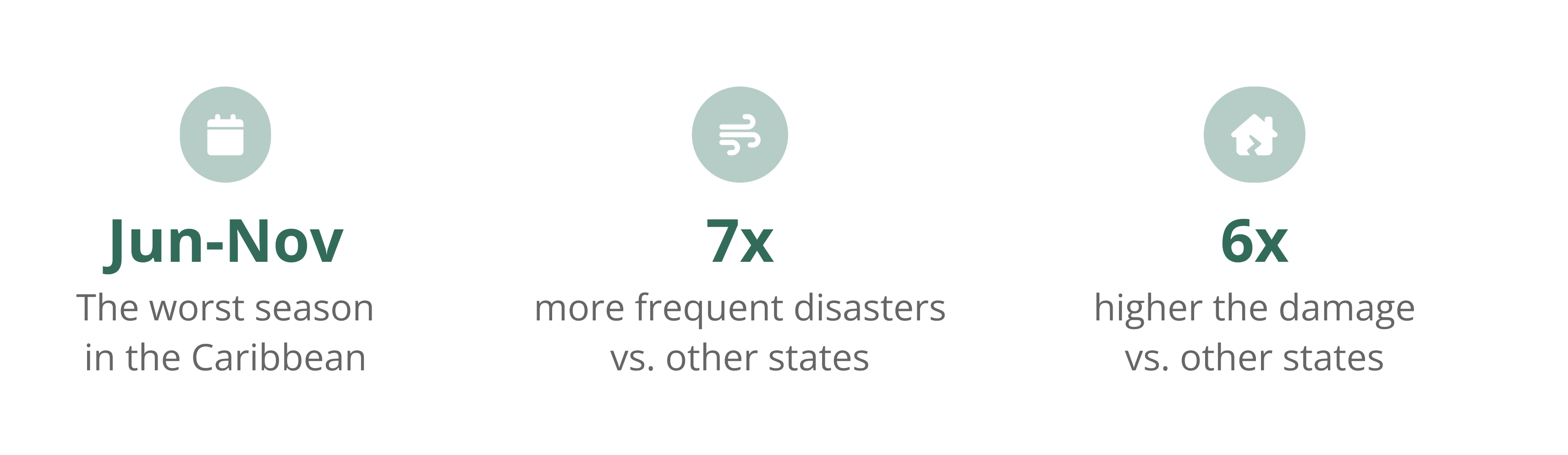
The Caribbean is the second most disaster-prone region in the world, regularly hit by natural and human-induced hazards. But getting a quote and filing a claim means going in person to an agency. Agencies also create reports for underwriters manually · a very time-consuming process.
The challenge
Instant quotes, streamlined agency backend.
Creating an app that allows users to get an insurance quote in minutes, and a back-end tool for agencies to calculate quotes faster, organize all quotes, claims, and clients in one place, and create automated reports for underwriters.
- Successful web-app and platform launch
- Pivoted to white-label versions for 4 different Caribbean agencies
- Decreased time for getting a quote: from 30–60 minutes to 5 minutes
- Revenue increased by 20% by adding a payment flow in the app
- Reduced agency employees' time spent on administrative tasks, freeing them for higher-value work
Agile innovation: Iterate fast
Paper Insurance was a startup, so we had to iterate fast. We used a Lean UX process for the MVP creation and collaborated with developers to make sure what we wanted to build was feasible and didn't take a lot of time.
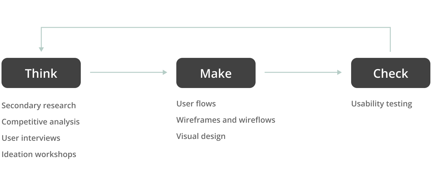
Understanding the problem: What do users need?
Secondary research
We had to research a lot about how insurance works in general, and specifically on these islands, along with information about natural disasters in the area. Edward, the CEO, was very knowledgeable on the topic, so we supported our learnings with his expertise.
Competitive analysis
There were a few competitors, mostly aimed at end customers in the US: Jetty.com, Lemonade, and Hippo. There were also back-end solutions for agencies, but not many tools considered the specific needs of people living on these islands.
User interviews
We interviewed agency employees and surfaced key learnings:
- Everything is manual and time-consuming: Creating a policy takes 30 minutes to an hour at minimum, and the customer has to go to the agency in person.
- App for employees: Most clients won't use an app on their own · agencies were thinking about using the app for employees to get a quote while at the client's house.
- Not everything is customizable: Many cases were handled informally, so not every case was automatable.
- Offline mode: Internet connection in some areas was unreliable, making an offline mode important.
Synthesizing learnings
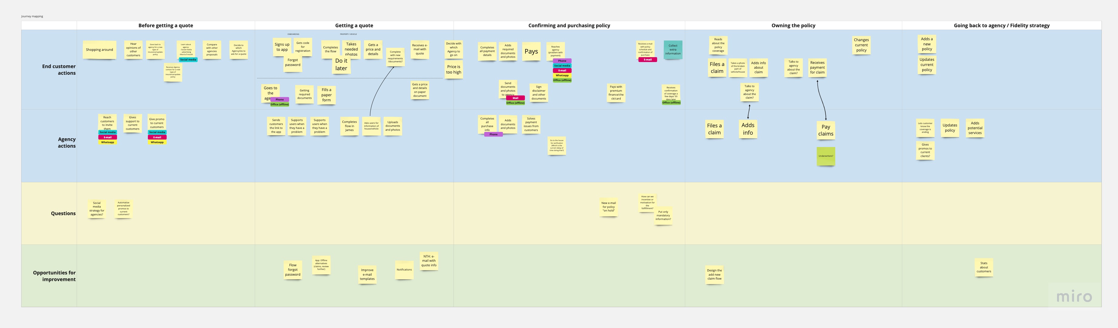
Conducting tests and interviews was challenging · there was a lot of education to do on the benefits of UX to the team and CEO. Synthesizing findings through workshops and creating a customer journey map with the whole team allowed us to explore ideas and ensure alignment.
Designing the vision: How can we make complex tasks feel simple?
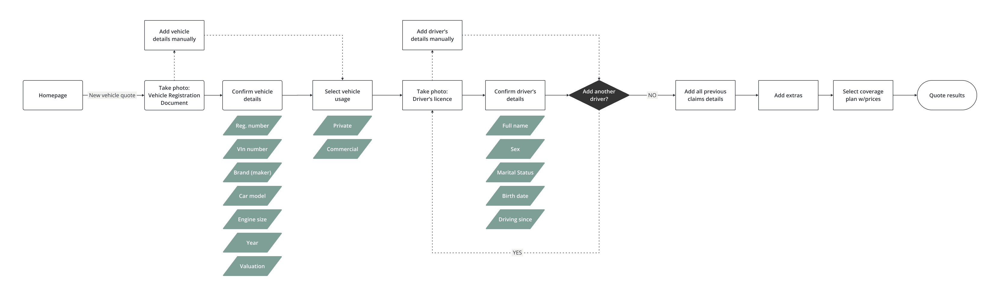
User flows
It was crucial to plan flows carefully from the start. Using other products as reference and what we learned from the business, we created user flows for the main tasks: get a quote, file a claim, renew policy, and more.
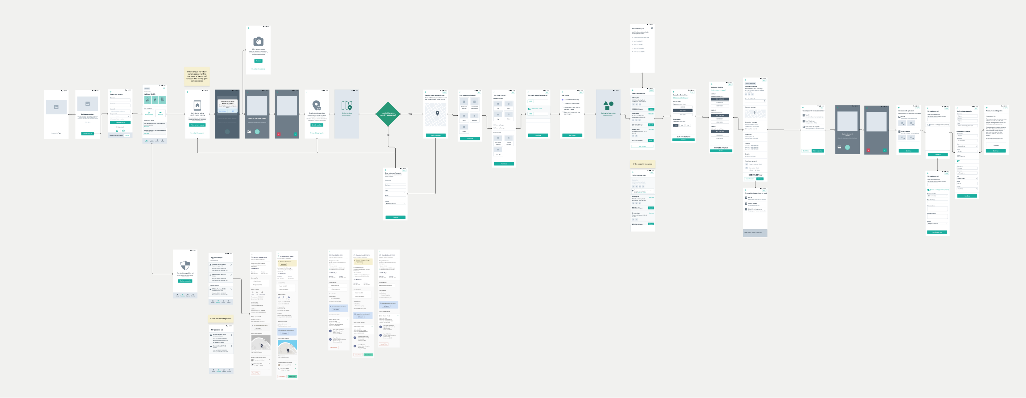
Wireframes and wireflows
The app: The first version was a responsive web app · faster to develop. The next version was built in React Native for both Android and iOS.
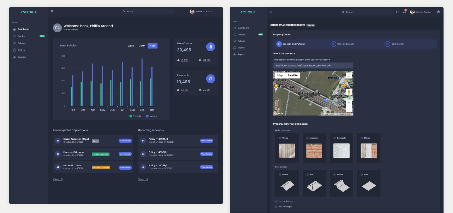
The web platform for agencies: We used a React template that allowed us to iterate directly in the live product.
Visual design
The focus of the client web app was to make it clean, modern, and easy to understand. Colors were taken from the existing branding guidelines. For the agency platform, the focus was on having all the information at hand and getting a quote as quickly as possible.
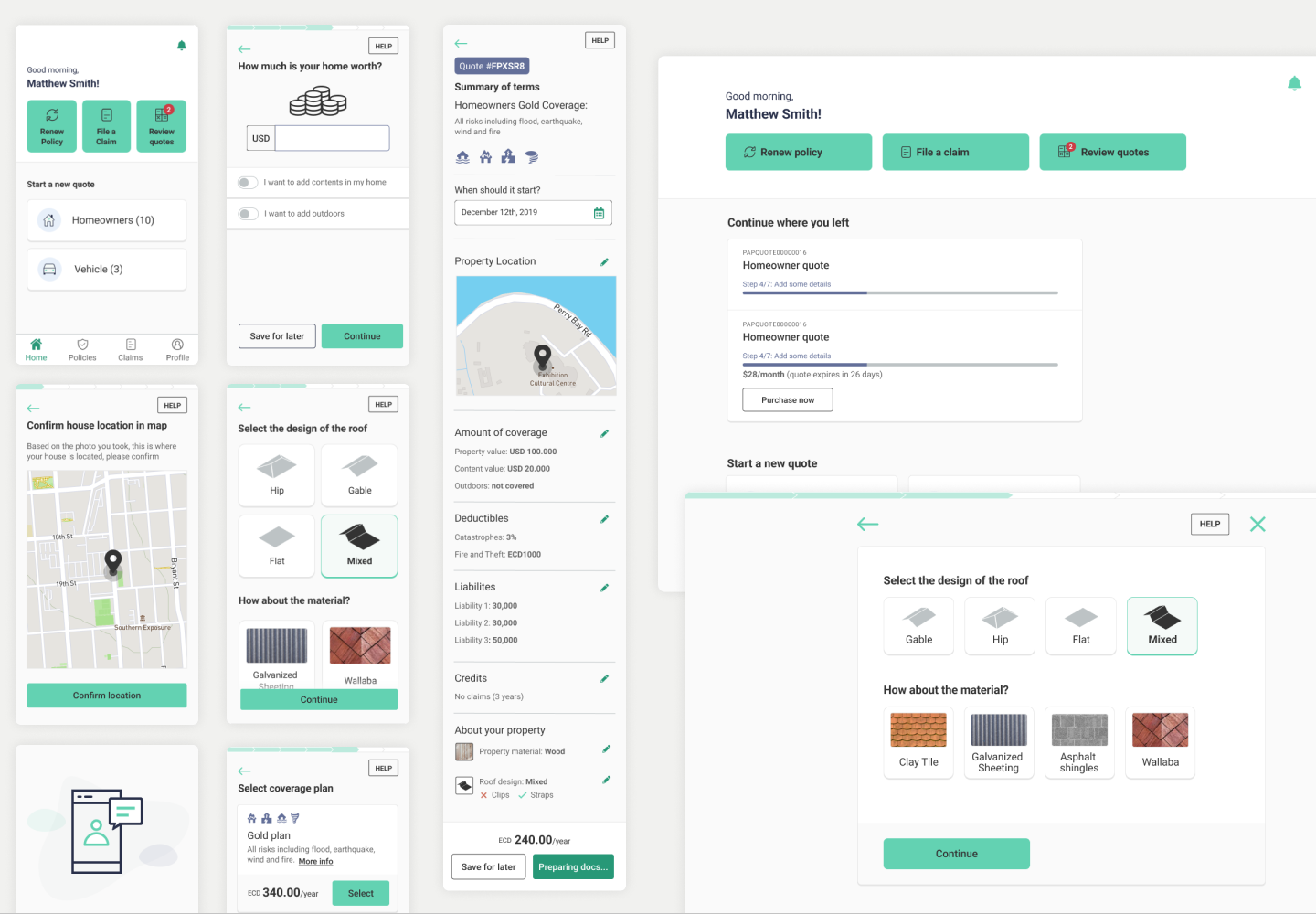
Theming
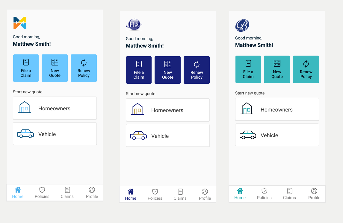
After some time, we understood that agencies were not going to use Paper's generic app, so the decision was to offer a custom-created version · a white-label approach where agencies could set their own colors and pricing rules.
Design system
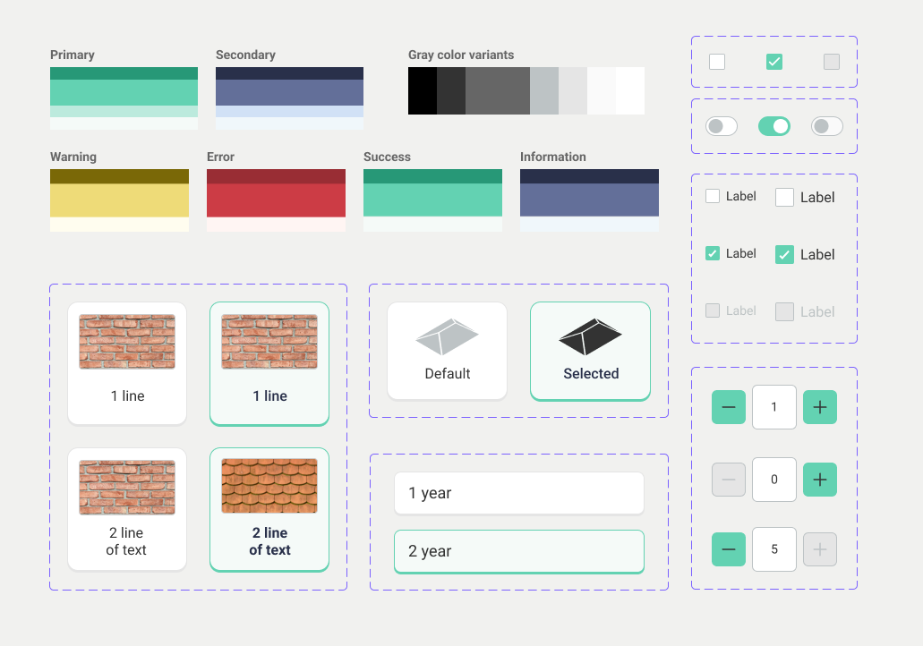
We created a design system in Figma to ensure consistency throughout the different flows and make collaboration with developers easier. It was also crucial for the new white-label approach.
Animations for loading states
There were many calculations to do on the fly. To make the wait less frustrating for users, we added animations at certain steps · for example, uploading documents and confirming location.
Validating and iterating: What makes sense and what doesn't?
Remote usability testing
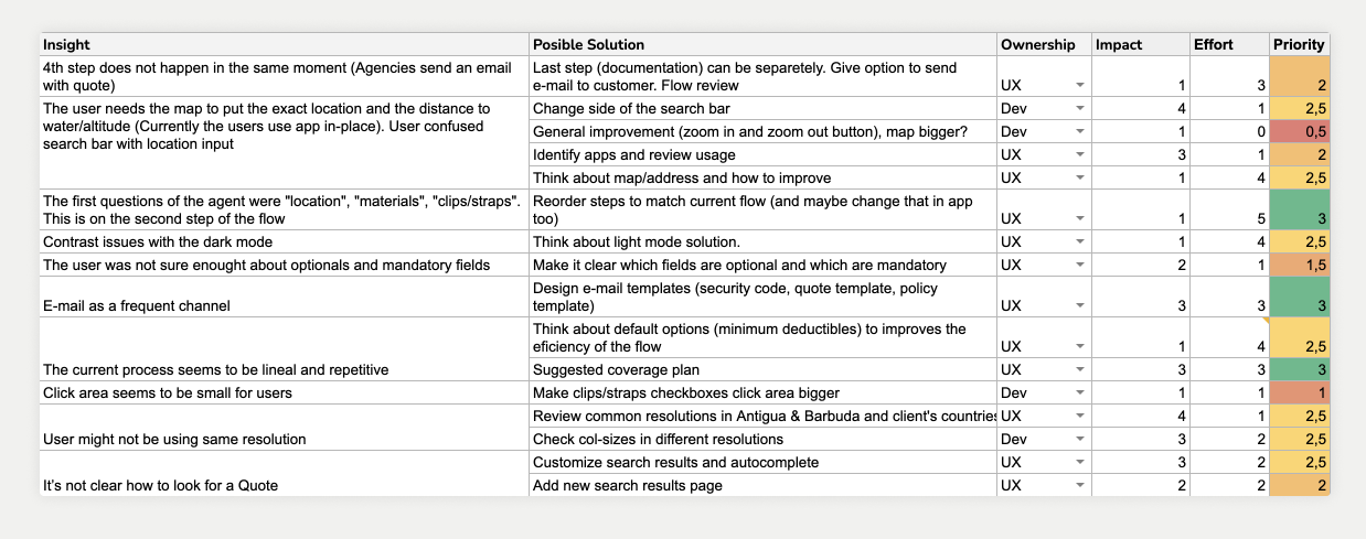
We prepared and conducted remote usability tests mostly for the web platform, used by agency employees. We found a few interesting insights that allowed us to iterate and improve the platform.
Most users were able to complete key insurance flows successfully without assistance after the redesign.
Learnings
Insurance products often involve complex terminology, high cognitive load, and emotionally sensitive decisions. One of the main challenges in this project was simplifying operational and customer-facing workflows without oversimplifying the underlying logic.
This project reinforced the importance of clarity, trust, and progressive disclosure when designing financial and insurance experiences · especially for users navigating stressful or high-risk situations.
Next case study
Protected · Private jets System of Apps